

Landing Page Mock-up
The Challenge
What would be the easiest way for writers, such as these aid workers who may not have experience writing or access to stable wifi and electricity, to communicate these emotional stories? Furthermore, how could these writers know the impact they had on building empathy? How can we translate this enhanced empathy into action by our readers?
MVP Requirements
A landing page with a three image carousel
An ability to submit stories
An ability to publish stories
A collection of stories
A single story page
A donation/volunteer page
Tabbed navigation including Submit a Story, Connect, About Us, and All Stories
My Role
UX and UI Designer, User Research, Usability Testing
Click-through Prototype
Duration
4 Weeks

Writer Dashboard Mock-up
Discovery and Definition
Personas and Customer Journey Maps
When considering this product, Refugee Stories has three different users: writers, readers, and editors to publish articles. I conducted a user interview with someone who was interested in understanding and reading more about refugee crises around the world.
Key Insights from Reader User:
User really wanted to know more about individuals and ways in which he could help them.
Lack of time to volunteer, but that could contribute monetarily.
Understood that there was a crisis and wanted to help, but didn’t necessarily know how to help and wanted to read stories about individuals and the ways in which refugeeism had impacted them.
Based on this interview, I created a persona, Henry, to help the whole team maintain focus and empathy for our readers. I developed a user journey map for Henry, starting before he discovered the website, reading the stories, having an emotional response, and catharsis through volunteering or donating. This helped build empathy for our reader user type and an understanding of his emotions, thoughts, and pain points as he moved through our website.


I also needed to consider our writer user type when developing Refugee Stories. I was able to gather anecdotal information from various humanitarian photojournalists’ websites. I also had a brief conversation with a humanitarian aid worker.
Key Insights from Writer User:
Desire to have a deep emotional impact on readers.
Refugee Stories has the objective of enhancing empathy and action, so is an advocacy reporting website.
Using Medium in the past to publish articles.
I synthesized my research into a persona, Stella, to represent our writers. Stella’s user journey map starts at the discovery of the website, as well. She signs up for an account (a minor annoyance), publishes her first article, waits for editor approval, and finally receives feedback through likes, shares, and donation/volunteer commitments from her story.


User Flows
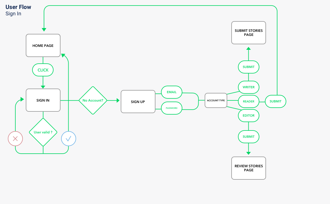
Sign in/Sign Up User Flow
User flows show us a step-by-step process that our users undergo to accomplish a task. Thus far I had developed two users - a writer as primary and a reader as secondary. However, we do have a third user - an admin/editor. Sign up and sign in became complicated when I started thinking about permissions to access certain content and features. Basic readers should not be able to access the editor’s page and writers should be endorsed or vetted to maintain high quality stories.
On sign up, a request for admin/editor permissions can be made and a special access code can be given via their email address. A request for a writer’s account can be approved by an editor. Finally, a reader’s account is open to anyone.
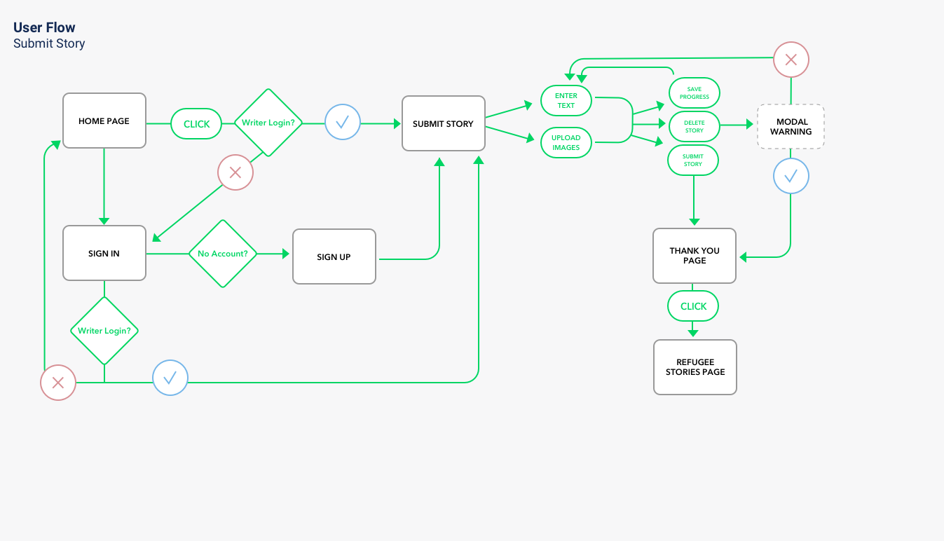
Submit a Story User Flow
I had to determine the steps a writer would take to submit a story. As we see in this user flow below, we must confirm that a user is a writer before we allow them to publish a story. We don’t want to waste admin/editor time with spam articles. A writer also needs to be able to enter text and upload images, all the while saving their progress. In crisis situations, electricity or wi-fi can be spotty and losing precious work would be aggravating and discouraging. I also included a “Thank you” page after submitting with information on the next steps - approval or rejection by the editor.

Volunteer/Donation User Flow
The ultimate goal of our site is to enhance empathy in readers and increase their chances of volunteering or donating via our “Connect” page. Once a user has clicked on Connect, they can choose to volunteer and be taken to a map of nearby opportunities, or for busier individuals, donate with links to reputable sites. My hope upon development of the site was that we could track the clicks on each individual story’s connect/donate links and relay this information to the writer to create a positive feedback loop.
Ideation

Crazy 8s Ideation
Carousels can be done well or poorly and designing a carousel was required in the project brief. I wanted to ensure that whatever landing page carousel I designed would be intuitive and easy to use for all users, especially because this would be the first face seen by those entering our site. I began by researching the best practices for carousels and looked at various websites implementation of them. In order to synthesize and explore my options, I conducted a Crazy 8s exercise.
From these eight different options, I designed two main versions of the landing page, one a typical carousel and the other a table of contents format carousel, to present to users in a preference test. There was not a statistical difference in preference between the two. I chose to combine them by moving the table of contents below the main hero image so that users could see all articles in the carousel while also maintaining the impact of the main image and article description. I believed that with no real difference in preference, combining the two in an aesthetically pleasing way would allow the strengths of both to be evident. If I had more time and users, I would have conducted another preference test and a usability test with my updated design to gain insight into user preferences.
I also performed a preference test for primary color selection. There was no difference between navy and orange. However once I checked accessibility standards, I found out that orange did not meet standards. For that reason, I used navy as primary and orange as an accent, while also using other affordances (bolding fonts) to help users with visual impairments navigate the site.
Low-Fidelity Wireframe
Based on the user flows above and considering my users’ needs, I designed low-fidelity mock-ups using Whimsical. Initially, I created a very basic form-field option for the Submit a Story Page. On iteration I remembered that my persona, Stella, had used Medium in the past to upload stories, so explicit form fields may not be required. I also realized that many modern-day sites auto-save as the user types, which is great for those who may not have stable wi-fi and electricity, and allowed me to not have a “Save” button/splash screen.

Submit a Story Wireframe

Landing Page Wireframe
High-Fidelity

When placed side-by-side, we can see how user testing and research has played a role in the evolution of the design. I maintained simplicity in the homepage to allow for the developers to focus on the MVP. I created a hybrid carousel, using the table of contents aspect with all content visible and placing it at the bottom much like the “arrow and dots” version slightly preferred by users - remember, there was only one user difference in preference between the carousels.
During wireframing, I considered arranging the All Stories grid differently than in the high-fidelity version. With rearranging you can also see I was able to fit more information about each individual story. This allowed the users to see more of the story contents with a quote, as well as information regarding the date published, the location, and the author.

All Stories Wireframe

All Stories High-Fidelity
Usability Testing
After most of our screens were created, I tested the design with three users from a usertesting.com panel.
The users were all able to “Submit” a story for publication without any confusion and they were able to understand the carousel. One user pointed out that I should have some authentication regarding writer credentials in the prototype. He and I were on the same wavelength, and after the usability testing I added a screen to “Sign In” as a writer first.
Additionally, all the users understood what “Contribute” meant in navigation. This is a departure from the confusion experienced by users when that navigation tab was labelled “Connect.” Users believed connect could mean anything from emailing people, contact numbers, and maybe donations. Contribute was much more clear, therefore I was comfortable proceeding with that label and defending that choice in MVP departure.
All the users truly enjoyed the website prototype. They remarked that they would come back and read more stories and direct their friends and family to the site for refugee stories and other information. I can’t take credit for the story, but I’m happy that users had a good experience that they would want to repeat - and all for a good cause.
Developer Handoff
Finally, I handed off our designs to developers. I used InVision Inspect to ease the transition. InVision solves a lot of problems faced by designers and developers during handoff by allowing for communication regarding feasibility of designs and comments directly in the designs. InVision also helps developers by providing CSS snippets required to code the design. Designers can also keep developers in the loop instantaneously by uploading designs as they change. After discussing the current skill level of the developers, I had to redesign the main carousel landing page to simplify it back to an arrows and dots design for deployment.
Overall, I’ve created something I am proud of, more or less, that can have a positive impact on others’ lives. It helps solve Stella’s, my writer persona, problems of finding a place to upload content that is not being covered by the current media lifecycle, and it also provides her with feedback regarding the impact her stories have had through donations and volunteer commitments. Our reader, Henry, also has a place to come to read about stories that aren’t covered and directly donate to causes that will impact the regions he reads about, or provide him with places to volunteer within his community. And our undefined editor user can view all submitted stories in one spot, look at a writer’s bio before allowing them to publish, and have up-to-date stats on work left to do.


