Personal waste management application
As climate change intensifies, it is more important than ever to build a more sustainable world. Many care deeply about this issue, but our daily lives get in the way of action.
How might we overcome this barrier to a healthier planet?

Various screens from My RiCi tab
How might we make it engaging to minimize individual waste?
How might we help people determine what is recyclable?
How might we build a community to support waste reduction?
My role
Competitive analysis
User research
UX design
UI design
Usability testing
The Team
4 user experience designers
Duration
10 week Human Centered Design and Engineering school project at the University of Washington
Where do we start?
The team began the project with a simple question: How might we minimize personal waste? Preliminary research helped us better understand the market and where a potential waste management mobile application might fit. A competitive analysis found that half of the mobile applications viewed had categories to help users determine what was recyclable, but did not use the camera to allow for quick and easy to access information. I also discovered that these applications did not include any social aspects, such as community support or connection to events. Finally, I determined that all of the applications were informational in nature and did not include any gamification or badges to help motivate waste reduction. With this information, we proceeded to user interviews to better understand our potential users needs.

Competitive analysis conducted to determine gaps in current products on market
Talking with the people that matter
We interviewed 5 different potential users of a waste reduction application. Our main target audience were people that are interested in reducing their personal waste. After talking with them for about an hour each, the team got together via a Zoom meeting and went over our main takeaways from each interview. Talking through each interview and breaking down the information into Motivations, Goals and Needs, and Hesitations and Pain Points was essential to fully understanding our users commonalities and what our product needed to provide.

Quick add tab for users who frequently recycle the same items
User interview insights
Motivations
Reducing their impact on the environment
Feeling they got when they were successful in waste reduction
Connecting with others, maintaining good relationships, and being viewed positively
Goals and Needs
Information that is accurate, quick to access, easy to understand and act upon
A community in which they could be supported, praised, and encouraged
Buying durable and long lasting products
Hesitations and Pain Points
Confusion about how to recycle plastics and other materials
Cleaning process undertaken before recycling materials and messiness of composting
Feeling alone in waste reduction efforts.
Lacking structure and habits

Joining a community challenge screens by Jacquelin Higgins
Time for some questions
Concurrent with user interviews, we developed survey questions and distributed it to our networks. By utilizing both interviews and surveys, we were able to get in-depth information from some users and a breadth of information from a lot of users. Both aspects were important to understanding waste reduction behavior and beliefs.
Survey insights
Most respondents believed they knew what symbols meant on plastics
Most respondents “sometimes” check how to dispose of an item
Respondents ranked quality and price as the top two aspects considered when purchasing products
70% of respondents lived in Washington state
Most respondents were aged 18-40
Most believed they recycled correctly
Respondents recycle a variety of items
Respondents reported placing items in the recycling even when unsure if they are recyclable
Defining our users
Using these insights, we developed one primary persona, one secondary persona, and two supplementary personas. Each of these personas were slightly different. Kyle, the primary persona, is focused on building a community and social responsibility. Sarah, the secondary persona, is focused on her family relationship, minimalism in buying, and the impact of waste reduction. Our personas also struggled with maintaining and developing good habits in their busy lives. I used these personas to guide our design work moving forward, targeting our primary persona and referencing the others frequently when thinking about the direction of our product.

Primary Persona
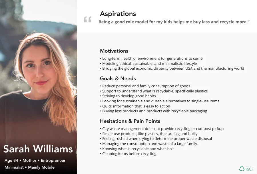
Secondary Persona
Our design problem, refined
User research helped me focus in on the biggest barriers our users faced and provided a clearer definition of the problem we wanted to solve. Ultimately, users wanted to do the environmentally-conscious thing, but sometimes life got in the way or they didn’t know the right thing to do. They wanted to form good habits, but being environmentally-conscious was time consuming and messy. Users wanted to have a community and a way to show others that they were accomplishing their environmental goals. These essential insights helped us refine our design problem.

How can we meet our users needs?

Sketching My Rici by Jacquelin Higgins
The refined design questions gave us several directions we could take our product. We determined that the next step would be sketching potential ideas that solved these better defined problems our users faced. We each took an hour to sketch different ideas for our mobile application. When we came back together, we reviewed our sketches to see the common ways we tried to solve our users’ problems, as well as the best solutions.
We determined that an application that utilized badges, points, and other aspects of gamification might motivate our users and engage our users in waste reduction, as well as build good habits. Ultimately, we needed to design something that overcame the negative aspects of recycling, like cleaning, sorting, and storing items, and allowed for good habits to take hold. This also filled a gap in the competitive analysis conducted at the beginning of our design project. I was eager to tackle this aspect of the design solution, so took charge of enhancing motivation and good habits through gamification.
A camera function that analyzed an image and provided information on recyclability would help users with quick and accurate information, and also filled a competitive analysis gap. In addition, we wanted to provide a means for users to verbally ask questions and receive answers, so we considered voice interaction with an AI character similar to Oscar the Grouch. This also provided an alternative for visually impaired individuals to determine recyclability of items.
Finally, a community tab that included a forum, friends, and an interactive game board map would allow users to build a community of environmentally conscious friends in a fun way. Once again, we could solve a user concern and fill a gap in products available.
How does this work in the real world?
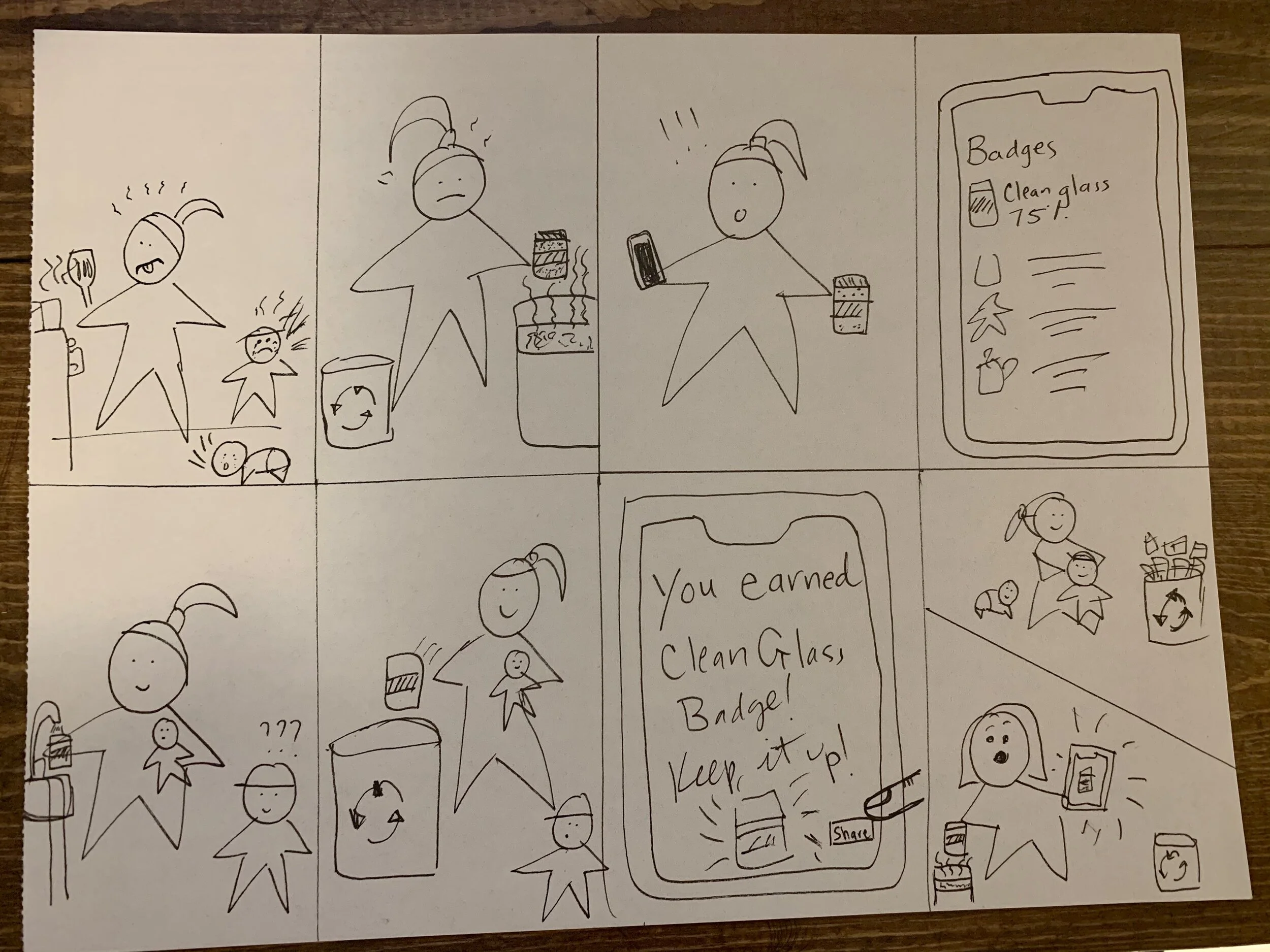
How badges might motivate a busy parent by Jacquelin Higgins
This application just had to make sense in our users’ day to day lives. Recycling, as our users stated and personas reinforced, wasn’t something that they did once per day or week. It was integrated within the context of their daily lives. And frequently, the hustle and bustle of their lives got in the way. For that reason, we determined that drawing up storyboards would help us understand how our users might fit this application into their lives. This helped us build empathy for our users and remember that they had complicated lives.
I created a storyboard that featured our secondary persona, a person that was motivated by her relationships with her family. The storyboard exemplified how a potential user might be more likely to recycle during the hustle and bustle of their daily lives when they remembered the badges earned and shared with others.
Yeah, but how do they get from A to B?
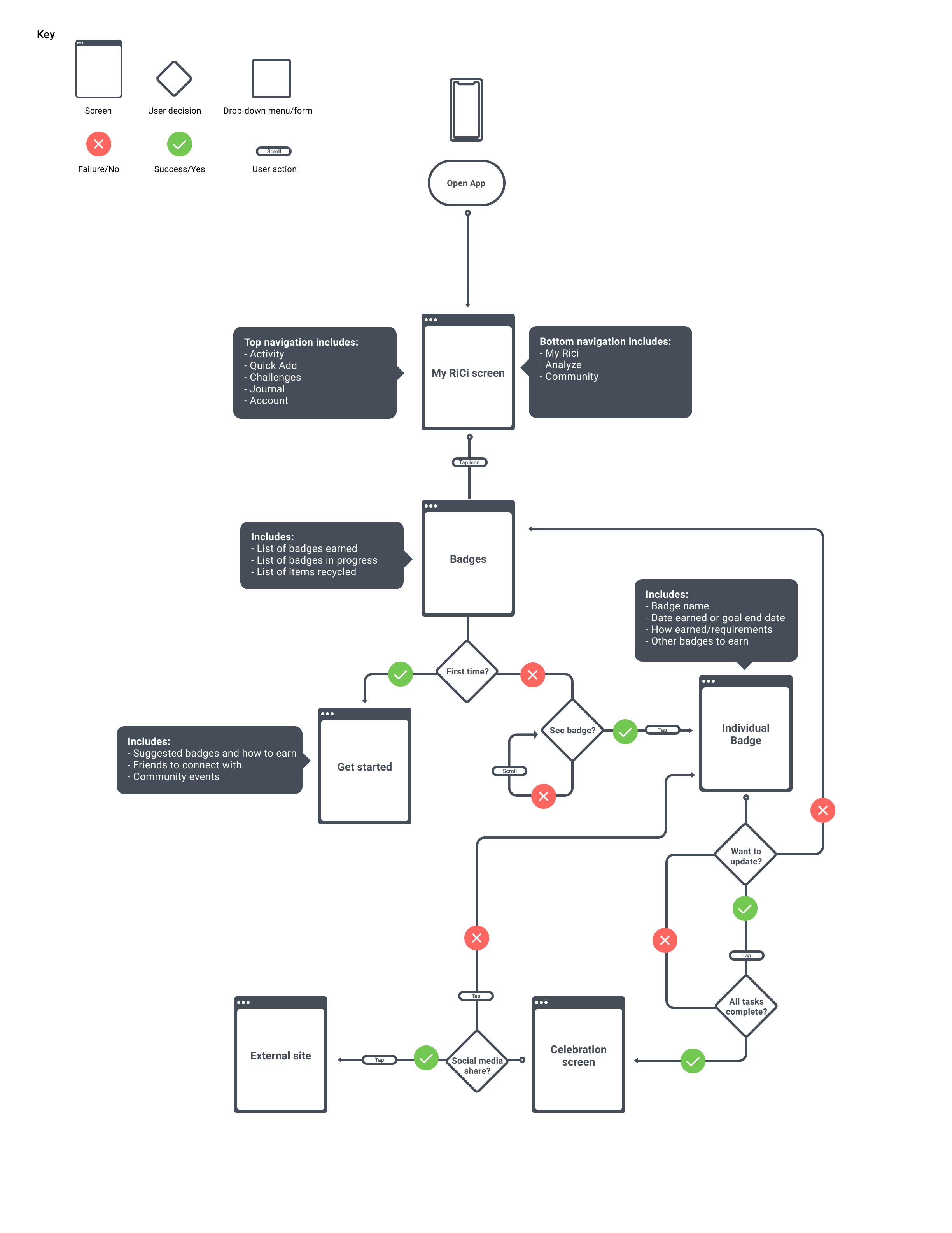
With basic sketches of our three different solutions and better empathy towards our users’ busy lives, we proceeded to user flows. This was an important step to solidifying how our users would move through our application to accomplish their goals. At the same time, we determined that we would have three main navigation options (Home, Scan, and Community) in the bottom navigation and within each tab there would be top navigation with elements that related to that main tab.
Home tab user flow

Scan tab
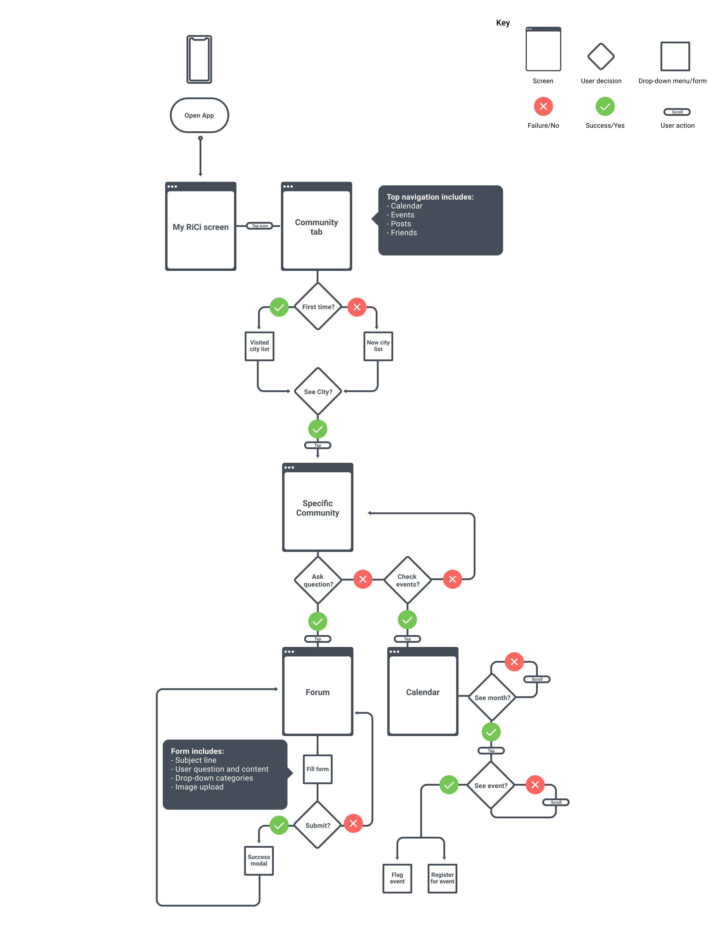
Community tab
From A to B 2.0
With our personas and user flows in mind, we started wireframing potential screens for our application to explore different directions and layouts quickly. We worked individually on each tab: Home, Scan, and Community. As wireframing progressed, I realized that some functionality detailed in sketching and the user flows was not what users might expect in a native application. Initially, the Home tab sketch had kebabs to select whether a user would explore the badge or the challenge. Creating a top navigation allowed us to avoid modals and bottom sheets, and provided a more linear process for users. It also allowed users to see a clearer difference between individual badges and challenge badges, i.e. individual badges don’t always match up with challenge badges and vice versa.
Furthermore, in our initial user flows for the community tab, we had fairly extensive GPS locating and assignment of communities and events that locked the user into a particular community. Upon further iteration and reflection on our personas, we realized that locking a user into a community before presenting them with events to join was prohibitory to their waste reduction. We determined that events should be based upon proximity to the users’ current locations and not hometowns or other permanent locations, along with event topics the users subscribed to and events their friends had joined.
Finally, when thinking about the possible outcomes after a user scanned an item, we determined that we needed to include a means for the user to request information about a specific unidentified or unknown item. This allows the user to provide feedback and point out gaps in the application’s database of products.
It’s all about that iteration
With refined user flows, I was able to start wire framing and iterating my screens. We determined that we would begin iterating at the level of wireframe fidelity because we wanted to have a strong layout and visual hierarchy before adding in colors and images that might distract. This also allowed us to move quickly from layout to layout, examining visual hierarchy and placement to form a solid scaffold to build upon.

Iterations of the individual badge screen by Jacquelin Higgins
Earning badges was a key motivating factor to our design, so I wanted to ensure I provided enough user feedback about progress towards badges. I designed several different ways of demonstrating this progress, as well. With critique and feedback, I determined that a simple circle with a closing ring was familiar to users and allowed the user to see the whole badge without obstruction and see their progress visually.

Badge iterations demonstrating progress by Jacquelin Higgins
Is this usable?
Given the time constraints of the project, we conducted usability testing with three users on the Scan tab and four users on the Home tab.
Scan tab usability testing insights
Users were confused about the phrasing of location to recycling receptacle
User was unsure about what action to take after analyzing completed and information presented
User wanted to scan multiple items at a time
Users struggled with the microphone option because the prototype did not allow for actual speaking
Users were unclear if an item was recyclable when information was presented
Users did not readily see the microphone option
Scan tab usability fixes
Rephrased the location radius to drop off in your current location
Provided a button to “recycle” and have it count towards badges in progress as applicable
Added a label for the voice assistant next to the microphone on the first scan page to make it easier to find
Added recycle iconography next to the information to visually enhance the information
Home tab usability testing insights
Users wanted more feedback after joining a challenge
Users stated they were “overwhelmed” by navigation at the top and bottom
Users wanted more information on graphs
Users wanted more feedback after completing a badge
Users were confused about individual badges versus challenge badges
Home tab usability testing fixes
Added a celebration screen after joining a challenge
Made bottom navigation more prominent by increasing the font size and weight of the icons
Added numbers to the graphs to clarify progress
Moved graphs to more obvious cards to show visual separation
Added a screen to celebrate an earned badge after quick add to show progress towards badges

Usability testing quote
Words matter
As we began to finalize our designs and get further design feedback, we talked about how to clarify the meaning of some navigation. In order to address the general confusion about what “Scan” meant (“Is it QR codes? How about barcodes?”), we changed the tab’s label to Analyze. We need further usability testing on this term change, but ran out of time.
As a team, we discussed what Home meant in navigation in other applications. Based on our personas, we determined that our users might expect a Home tab to be similar to Facebook’s running list of friend’s posts or Instagram’s scrollable images posted by friends. Our Home tab did not contain that information, so our users might have different expectations with a Home label. In order to provide clarity to our users, we renamed the tab to My RiCi to exemplify that the tab contains information about the user and their waste management behaviors. We need further usability testing on this term change, but ran out of time.
We also had discussions about what Events consisted of and where they should exist within the application. We determined that our understanding of Events was two-fold: Events in the Community tab were in-person lectures and gatherings and Events in the newly re-named My RiCi tab were digital competitions similar to challenges in other applications. Because users were familiar with challenges in other applications, like exercise applications, we determined that My RiCi’s Event label in top navigation should be renamed Challenges. This label change provided familiarity to users and was confirmed in usability testing.
The look and feel of the product
Material UI icons were used throughout the prototype to provide a cohesive look and feel to the product. Many users are familiar with these icons, as well, so it is easier for users to understand the iconography and meaning in our application. We determined that green would be a good brand color as green is associated with the environment and I ensured that we met color accessibility standards when selecting the hue. Finally, we utilized Open Sans for the font for its readability and friendly feel. I designed a style guide that would ensured correct colors, text hierarchy, button sizes and other user interface elements would be implemented correctly by potential developers.

Style guide by Jacquelin Higgins
Hi-Fi(ve!)

Selection of high-fidelity My Rici Screens by Jacquelin Higgins
After completing usability testing, making changes, iterating, and defining our navigation we solidified our designs and created a high-fidelity prototype of our application. We all worked hard on our individual tasks, and open communication was integral to our success. We met frequently via Zoom meetings to provide design feedback, Figma tips and tricks, and discuss next steps in the project.
Looking back on what our users wanted, the team created something that met user needs and and was something they found value in. During usability testing, many users commented that they needed this application in their lives and said that they would love to earn badges while doing something good for the planet.

Our design, in three sentences, provided what our users wanted.
Next steps
If we had more time, we would want to continue usability testing on our most recent iterations. I would like to explore how to better differentiate between badges earned during individual endeavors versus badges earned in community challenges. With badges being integral to engaging the user over time, I would like to design more variety, as well as consider different ways of presenting them to the user such as sticker sheets with outlines to be filled in when badges are earned.
Many users also wondered if they could take an image of a pile of recyclables and have the application automatically add the individual items to the badges. We would need to explore this concept further before knowing if it is technically feasible.
When considering the Analyze tab, we did not consider an important fail case and did not provide a solution for it. It would be beneficial to design a form that users could complete if an item was unidentified. For example, if a water bottle was analyzed, but not identified, a user could be direct to screen with drop down menus that propagate based on previous entries. So the user could select water bottle, then the next drop down content would be populated with vital information for identification and so on until a proper identification and information could be provided.
Finally, because some users were overwhelmed with top and bottom navigation, it would be beneficial to explore moving some top navigation elements into the bottom navigation, such as moving challenges, individual badges, messaging, and notifications down. With these considerations, it would also be helpful to conduct a card sort on our revised information architecture to ensure we met users expectations.
What we learned
This 10 week project from inception to high-fidelity prototype was fast paced and very rewarding. It was complicated by being fully remote due to the COVID-19 pandemic, but we all rose to the challenges and designed a functional, useful, and beautiful application. I learned a lot:
The importance of open and frequent communication, especially when working remotely.
Definitions of words make a big difference in how a user understands the product.
Sometimes initial user flows don’t make sense after fully understanding user expectations.
You can’t always accomplish everything. Get to the stuff your users need right away.
User research is the best way to understand what design questions you should be asking.