Washington 211 Usability Testing
Washington 211 is a state-run nonprofit web and phone service that connects people to critical community resources. WA211 primarily serves those who are experiencing crises and are low income. Usability testing was conducted to guide upcoming iterations of the website.
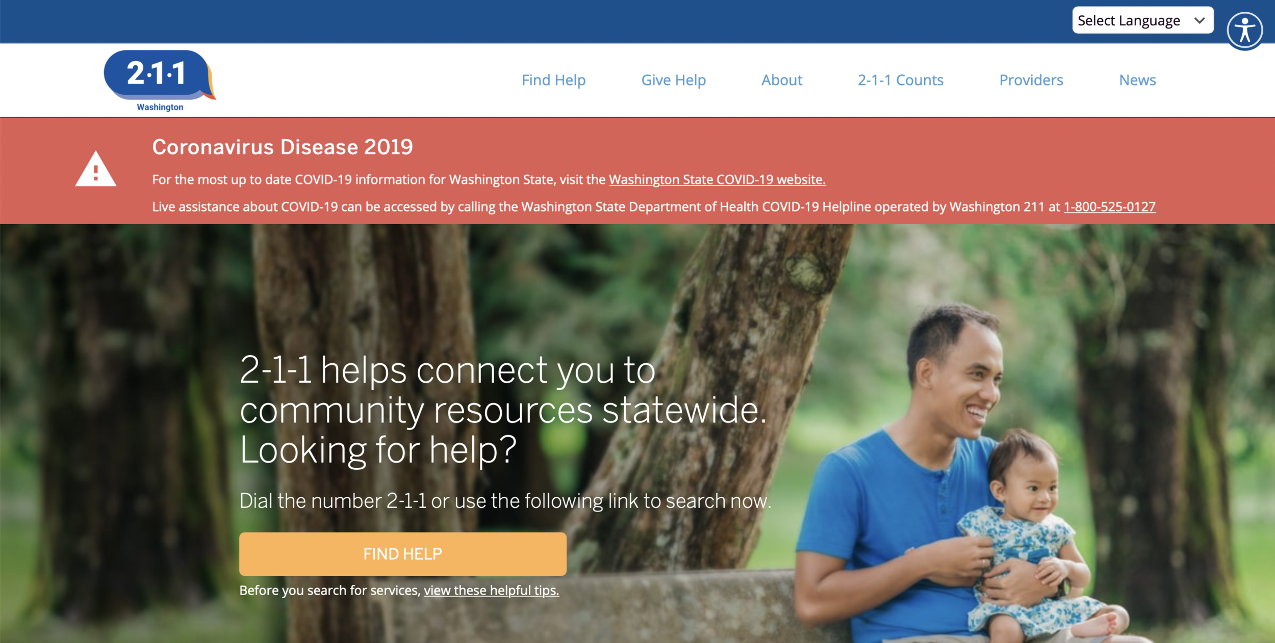
WA211.org Desktop homepage |Displays implementation of usability testing recommendations
What are the major frictions and confusing experiences encountered by users when searching for resources?
How does WA211.org compare with 211CT.org?
What are the recommendations that can be made based upon the usability test?
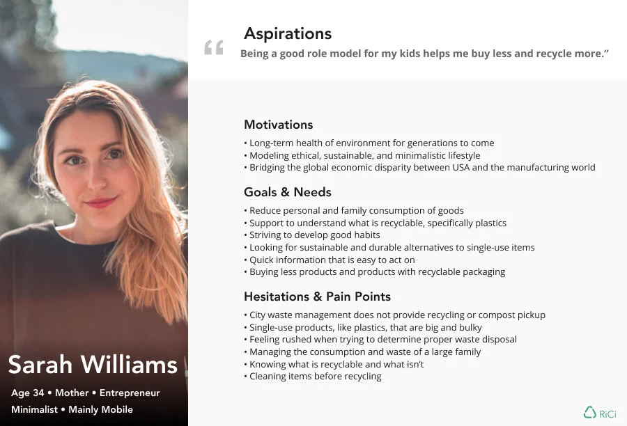
The Team
4 UX researchers and 1 WA211.org stakeholder
Duration
10 week usability course in the Human Centered Design and Engineering program at the University of Washington
Methodology
Participants
With stakeholder direction, we developed a screener to target users that fit the following demographics:
having a cognitive disability and/or
having limited English proficiency and/or
having minimal tech literacy.
We deployed the screener to several different online communities and within the WA 211 network of agencies. We quickly discovered that participants who met the target users were difficult to recruit, partially due to the pandemic. Due to the strict timeline of the course and our inability to safely engage with participants face-to-face, we broadened our participant pool to include proxy and pilot users. These users had the following demographics:
100% reported using the internet daily
100% were between the ages of 18-26
85% identified as female
Despite this limitation, we were able to identify critical barriers to finding and utilizing resources.
Comparative approach
In this usability test, WA211.org was compared to 211CT.org, which was chosen because of:
similarities in UI, taxonomy, and functionality between WA and CT
previous comparative analysis of WA and CT by WA211.org stakeholders
WA211.org utilized 211ct.org in their web development plan
Participants were randomly assigned to start with either wa211.org or 211ct.org to control for experience bias.
Test Plan
We developed and implemented a pre-test interview questionnaire, three tasks to be completed on both wa211.org and 211ct.org, and post-task ratings of difficulty.
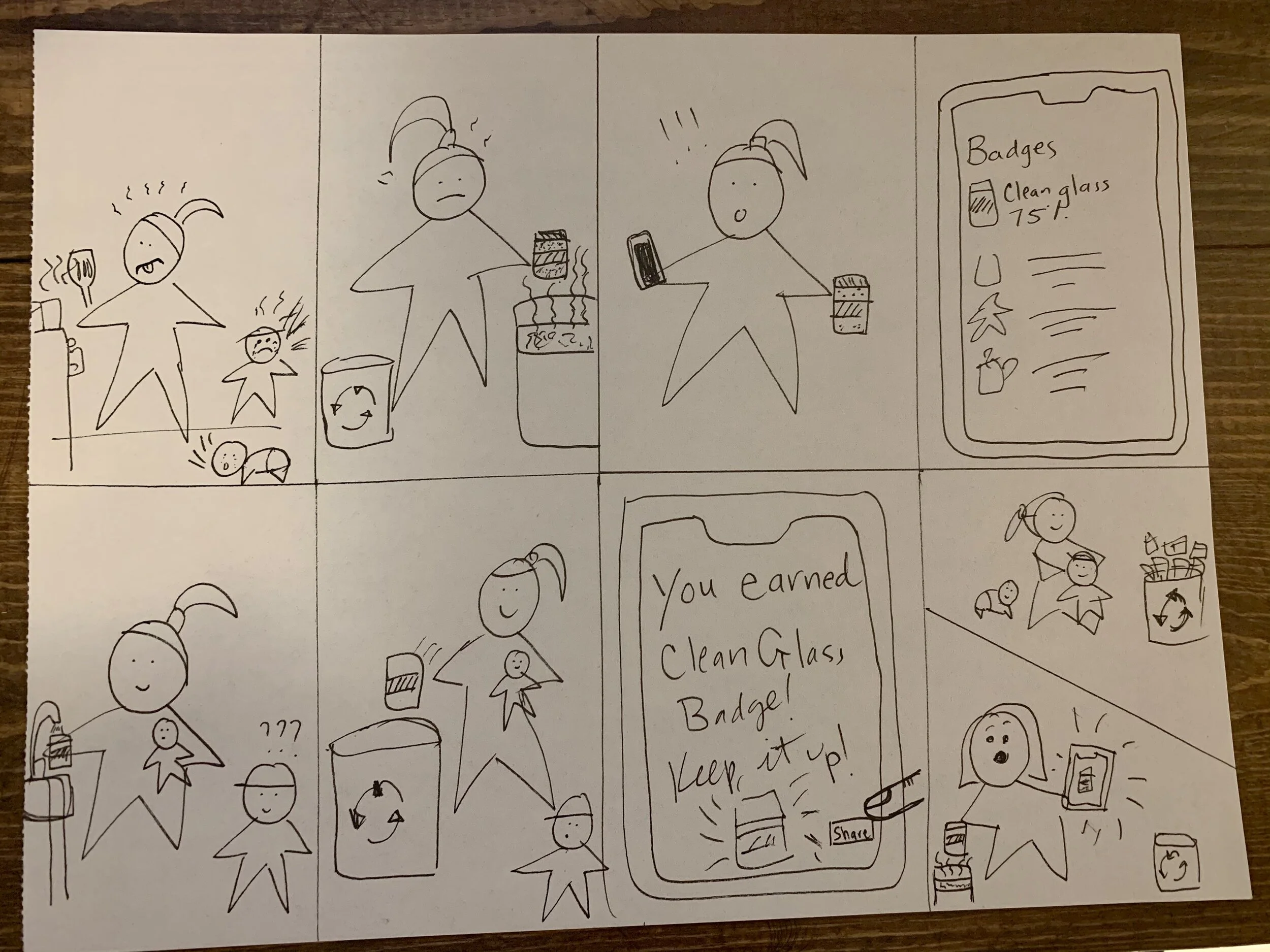
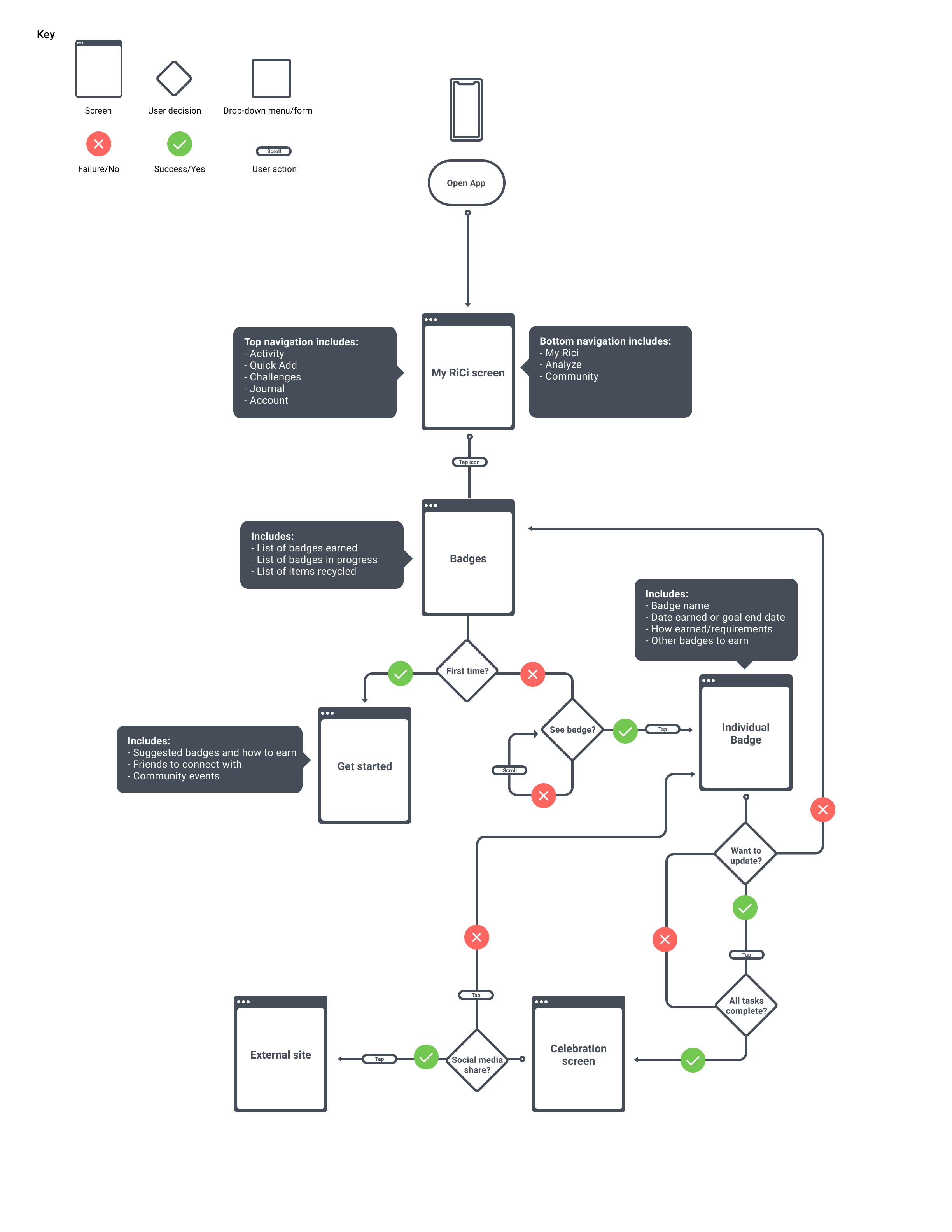
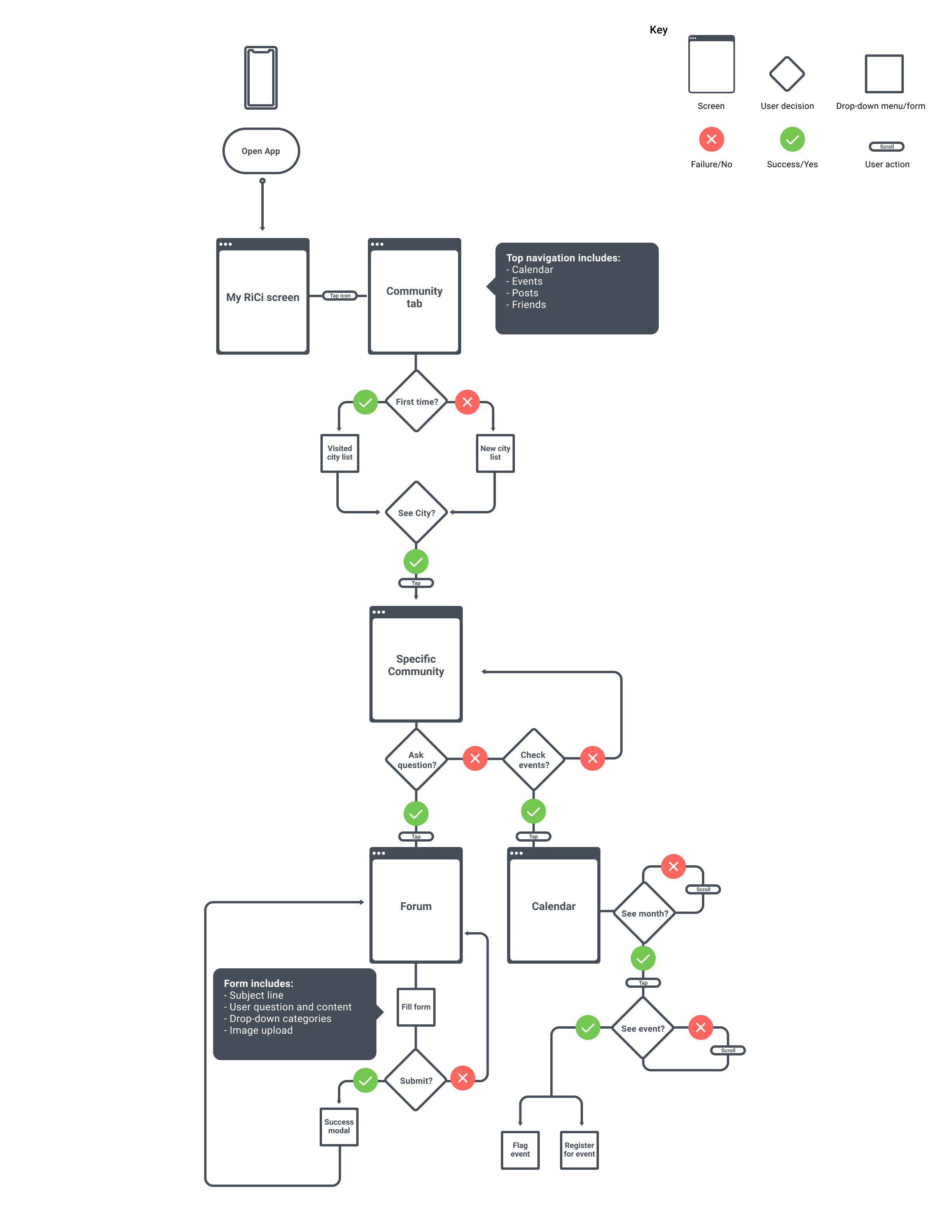
Findings
Finding 1: Difficulty starting search

Homepage of wa211.org
The visually busy nature of the homepage pushed the “find help” button below the viewport requiring scrolling to begin searching. Additionally, the homepage did not include a search bar which participants anticipated and the search bar was two clicks away from the homepage. The covid-19 chatbot occasionally obscured the “find help” button.
Recommendations
Remove, shrink, or provide a means of closing the covid-19 banner information.
Decrease the prominence of the covid-19 chatbot.
Move the search bar to the homepage and place within viewport
Finding 2: Accessibility icon unrecognized
Participants had varied interpretations of the accessibility icon including:
A dark mode
A means of hiding aspects of the website
Recommendations
Utilize the international symbol of access. Hover effects and tooltips should state “accessibility”
Finding 3: Text-heaviness of resource page
Participants had difficulty understanding certain categories of information on the resource page and had to reread the content several times to understand. The text was dense and lacked definitions of key words.
Recommendations
In order to allow participants to quickly and efficiently browse resources we recommended that:
bulleted lists be used to delineate information
improve the visual hierarchy so users can determine important information faster
increase the line-height to increase readability
implement tooltips for hard to understand words and phrases
Finding 4: Lacking resource connection and next steps
Resource information was available to participants, but when they decided to pursue a resource, the links provided routed the participants to the resource homepage and not the next appropriate step to take to utilize the resource.
Recommendations
Provide a direct link to an application or next steps on the external website .
Provide information on the necessary application materials.
Next steps
A formal report was provided to the stakeholders of wa211.org. They reported that the implemented several of our recommendations. Further usability tests should be conducted on these recommendations
What we learned
This 10 week project from our initial stakeholder meeting to the final report was fast-paced and challenging. It was complicated by being fully remote due to the COVID-19 pandemic and the strict timeline of the course which prohibited us from recruiting target participants, however we learned a lot:
The importance of flexibility and adaptability when a project doesn’t work out as planned.
Open communication, especially in a remote world, is vital to meeting timelines.
Qualitative data, such as user quotes, can be more informative than the quantitative clicks and taps.