

Initial screen of payment processing user flow
How might we reduce barriers to learning English in Bahrain?
Knowing English is the key to economic security in Bahrain, but there are many barriers to children learning it. SpeakOut aims to conquer those barriers by providing online access to registration, tuition payment, and eventually classes. We had two weeks in which to understand Bahraini culture, stakeholder needs and design a new and improved web app experience, complete with online registration and tuition processing.
My Role
Facilitator Role during week one
UX/UI Designer
Customer journey map
Usability Testing
Tuition Payment Processing
Landing page initial design inspiration
Duration
1 Week Research
1 Week Design

Desktop landing page above the fold
Understanding Bahraini Culture
We started the week off by conducting a stakeholder interview with the founder of SpeakOut. Her expertise was invaluable when it came to understanding Bahrainis and users of her website. We wanted to understand her current needs and desires for the web app, as well.
Stakeholder Interview Insights
There are many barriers to children attending classes, including lack of transportation, parental time and money
Families discover SpeakOut through Instagram
Most Bahrainis use BenefitPay for debit card transactions
Most families and teens use mobile devices and do not have laptops or personal computers
Highlighting native English speakers is important to her company

The father, Naveed, customer journey map
A prototypical Bahraini father and daughter
Based on the stakeholder interview, we determined that there could be multiple user types of the websites including parents and older tween and teen children.
The timeframe, distance, and language differences could potentially impact our ability to design with the user in mind. Proto-Personas and customer journey maps were integral to maintaining empathy, cultural sensitivity and direction during the design process. I collaborated with another team member to develop a father and daughter customer journeys map.
Cultural implications were widespread throughout the design, from including hijabs on women and young girl images within the design to having an understanding that Bahrainis in general must spend time getting to know you as part of business relationship building. Furthermore, a letter of introduction from someone a family already trusts is integral to forming a relationship with a business and that communication is generally formal and hierarchical.
I found myself thinking about Naveed and Amira as we progressed through the design process. Their prototype-personas and customer journey maps, backed by research, allowed us to structure the design in a culturally sensitive way. It informed the design throughout, allowing trust building to occur from discovery on a friend’s instagram feed, viewing the landing page with photographs of people that look like them and a vision they could embrace, and using BenefitPay, a payment processing company that they knew and trusted.
Initial Milanote IA developed by the design team
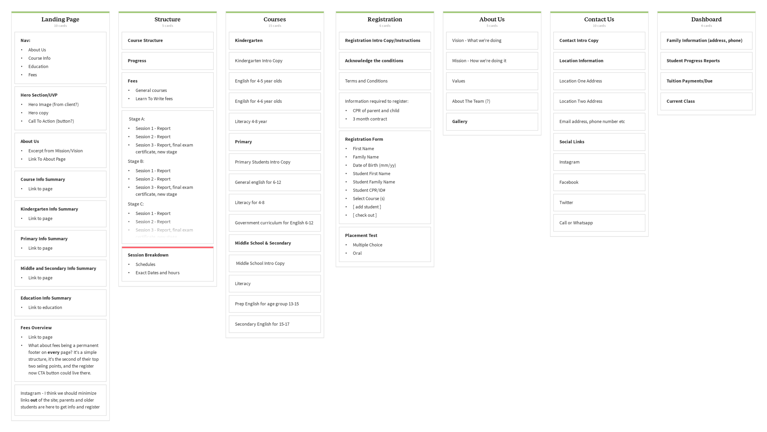
Organizing the content
With a major redesign of the website, the team wanted to ensure that the information architecture was set up in a way that users expected. While half the team worked on developing a firm grasp of the families and culture, the other half gathered and organized the information on the website and developed an information architecture. I strongly suggested that we conduct a card sort on the information architecture developed to ensure our users could find information when they came to the website. We found that users, more or less, organized the information in the same way as the team.
Despite the initial IA success with minor variations, we had to reconsider the information architecture not once, but three more times. We had hoped to group more content on certain pages, but when we got to the mobile wireframes we quickly realized that the amount of content was simply too much. I reiterated that families using this website mainly have mobile devices and it would be very difficult to scroll through what was essentially a wall of text. This was an assumption that given more time I would want to conduct usability testing on.
With that in mind, we reorganized the information and broke down the content into easier to access categories. If we had more time, I would want to do another card sort or usability tests to ensure that our content was organized in an intuitive way. Using the fourth iteration of the information architecture, we developed a site map and user flows through the MVP of tuition processing and registration.
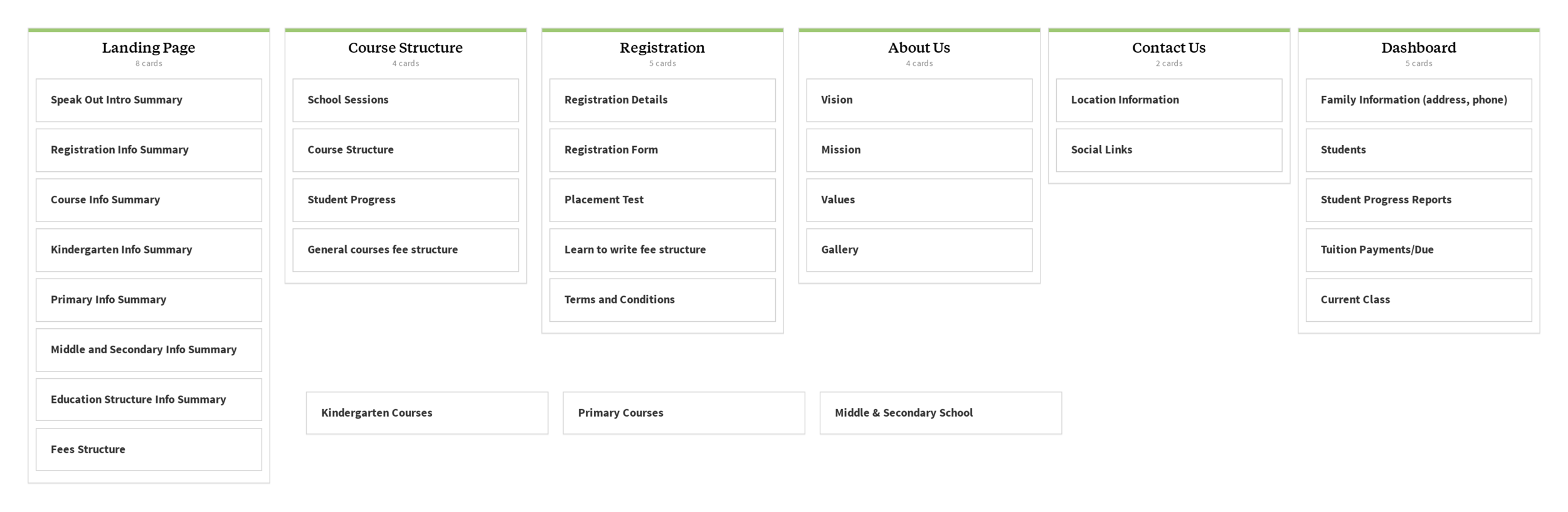
Fourth Iteration of the IA developed by the design team after developing Course Structure wireframes that were text-heavy for mobile.
Learning about the payment portal
Once I started thinking about the tuition payment processing in depth, I discovered that the initial user flow was not detailed enough. I spent a few hours researching BenefitPay and how we could incorporate their portal into our designs. Through my research into BenefitPay requirements, I realized that we needed to design a confirmation of payment, an error processing, and a declined payment page. I added those details to the user flow and wireframes, along with a receipt and payment history.
Initial ideas
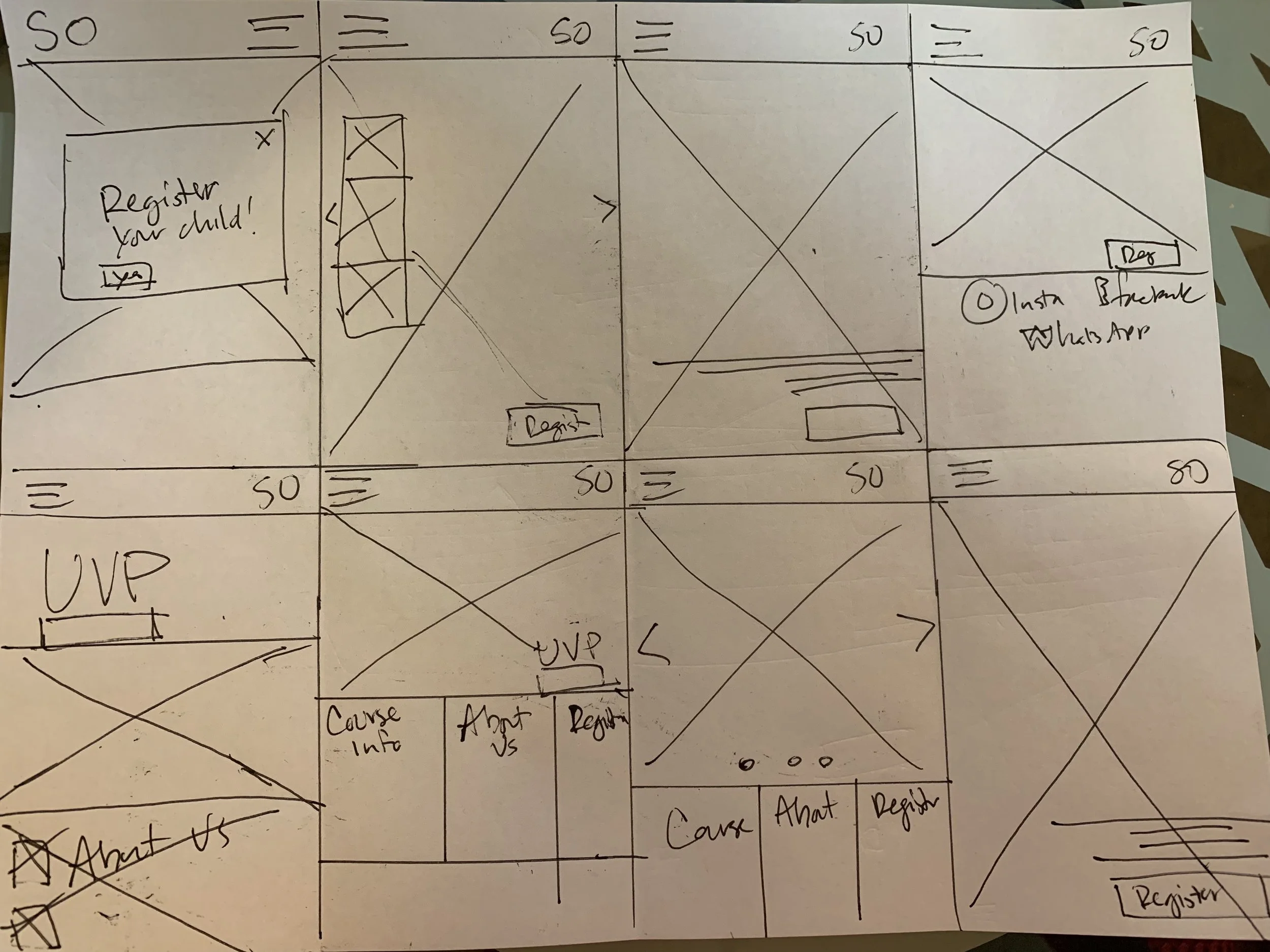
Ideation sketches of Landing Page
Landing Page
We decided as a team to focus our group ideation on the landing page because users would see this first when coming to SpeakOut’s website. We started with sketching so that we could quickly explore a variety of options. I completed a couple rounds of Crazy 8s, trying to encapsulate the content above the fold for mobile as most users only have mobile devices and this redesign would be responsive. I sketched some carousel options, considering that the Stakeholder had many images she included on her original website. I also focused on a Call-To-Action button to register, UVP, and a bold hero image.
In order to build consensus, we gathered all our sketches together and dot-voted. We were nearly unanimous on the landing page that best fit stakeholder and user needs. With this decision made, we progressed to wireframes with each of us working on our own sections.

Sketches of Tuition Payment Process
More sketches and notes about the payment process
Before I progressed into wireframes, I quickly drew a few sketches and wrote some notes on the research I discovered about BenefitPay. I assumed most users would worry about the security of websites asking for credit card information, so I wanted to ensure that I presented them with a process that was expected and used the debit card transaction company in which they were familiar. I wanted the users to understand exactly what they were paying for, as well as have confirmation and a Thank You page for the payment. It was important to me that the user flow was intuitive and built trust, much like the porto-persona and customer journey maps portrayed Bahrainis.
From sketching to wireframes
In order to solidify our designs from our sketches and conduct initial usability testing, we moved into wireframes. I started with the mobile designs because this was how most users would access the website and we needed this to be a responsive web app. I included without any redesign the BenefitPay Company gateway screen exactly as the parents would see it when paying online. I included a progress bar above so that users would know exactly where they were in the process and how many screens it would take to complete the transaction.

Mobile Wireframes of Tuition Payment Process
Reality check: does this work?
With all the wireframes complete and prototyped together, we used usertesting.com to have six people test our mobile design and five people test our desktop design.
Usability fixes
A “learn more” button on the landing page to help users get clarity on SpeakOut
Clarifying language about the test being for the registered child
Ensuring continuity in number of children registered in the prototype
Usability testing insights
Confusion about whether SpeakOut was an online school
Who takes the placement test? Child or adult?
Continuity within the design is important even in the wireframe phase
User remarked tuition payment was “No sweat!”
Users appreciated the progress bar
Perhaps the biggest problem with usability testing was the lack of Bahraini families. We were unable to recruit any families or Arabic people due to the timeframe limitation. With many cultural implications, I would have liked to have testing completed with Arabic or Bahraini individuals to ensure that we were meeting their expectations, building trust, and had an intuitive process.


Pixel perfection delivered
Accessibility
With the usability concerns addressed, we proceeded to high-fidelity. I and another designer developed a design system with Material Design as the inspiration. With the website’s focus on families and being a school, accessibility was at the forefront of my mind. The stakeholder mentioned that she recently developed her logo and wanted to use the colors within it on her website. When I started developing buttons and text, I checked the color contrast accessibility through WCAG and found that both the red and the blue in her logo did not meet the standards. For that reason, I used a slightly darker version of red that was accessible and within the color palette. Finally, I researched color meanings for Arabic countries and found that blue held some negative connotations (death, illness) and that red represented love and passion. Furthermore, Bahrain’s flag features red and white. These findings affirmed our choice of red as the primary color in buttons and progress bars.

Tuition payment
For the Tuition payment processing and throughout the website, I decided to incorporate HUMAANS into the design to add visual interest as well as a way to communicate family, belonging, fun, and progress through the payment processing. HUMAANS provided a human face to an otherwise transactional process.
The highly customizable aspect of HUMAANS was also ideal to ensure we had an on-brand and culturally sensitive experience throughout, complete with hijabs for women and girls.

User flow from payment summary to receipt
When the user entered the Tuition Payment Processing they could mark their progress through the progress bar above, as well as viewing the family entering from the left and progressing to the right. In the Arabic version, I imagined the family entering on the right and progressing to the left with the progress bar reversed, as well.

Mobile sign in page and drop down menu
Landing Page
Once I completed the high-fidelity versions of both mobile and desktop, I reached out to team members to see if they needed any help. The team member working on the landing page welcomed collaboration, so I took what was started and added my own take on it. We both worked individually on the landing pages and came together to vote as a team on which design we thought would meet the stakeholder’s needs of something professional and fun. In the end, a hybrid version of both our work was preferred by the majority of the group, including a “Learn More” call-to-action button alongside the “Register Now”.
In my version of the design, I preferred to keep it to one call-to-action because the stakeholder had shared that most people going to her website had discovered her school through Instagram and word-of-mouth. Two calls to action is also unnecessary because as a user scrolls the landing page, they can learn all there is to know about the school through several secondary calls-to-action below the fold. Given more time, I would want to conduct A/B testing with users to see whether there was a difference between one CTA or two with regards to registering and paying tuition - the main actions desired by the stakeholder.

Payment history list
Learnings
Working with 7 other designers on a project for two weeks was difficult, amazing, and fulfilling. It was wonderful to see how other people viewed the problem and wanted to address stakeholder and user needs. In the end, I think we created a product that families will find useful and enjoyable and meets stakeholder needs.
I was able to provide a succinct and user-friendly Tuition Payment process. Another group pushed hard to have an amazing registration process, considering multi-child families. We pushed ourselves to include online test taking and completely redesign the website from landing page to content pages. Two team members also completely design a dashboard for families in which they can track student progress. We fully considered the information architecture and content within the site, as well.
I was focused on ensuring that our website was visually accessible to all people. I was also motivated to ensure our landing page was the best it could be given the time and image constraints we faced. Ultimately, there is plenty that could be improved upon on the landing page and throughout the site.

Tuition payment receipt
Next Steps
Given more time, I would want to conduct more usability tests on a few aspects, including recruiting Arabic or Bahraini families, and iterate. However, I feel that the results of our usability tests and changes implemented will allow all users to pay for tuition, register their children, view progress, and learn as much as they’d like about the school before registering.
I would have also enjoyed designing the Arabic version.
As a team of 8 designers, we worked hard to ensure that people like Naveed and Amira would have a great experience with the website, build trust, and spread the word about SpeakOut to their friends and family.
Happily, the stakeholder chose our design of the three to build into her new website.